
Online marketing is a business owner’s best friend. When you take your business online, you’ll need a powerful digital marketing strategy that captures your brand message perfectly and promotes it across several channels. Today, we’ll take a close look at one of the most effective tools for doing just that – the landing page.
A critical tool for promoting your brand, landing pages have enormous power in driving conversions. By using a landing page builder to design and customize your landing pages, you can precisely target your audience and guide them through the sales funnel.
Let’s delve a little deeper into how landing pages work – and how you can use them to your advantage.
What is a landing page?
A landing page is a standalone web page created to achieve one goal: conversion. It’s a great asset for a marketing or advertising campaign. This page can appear in response to clicking on a search engine optimized result, email marketing campaign, social media campaign or online ad. This type of marketing is instrumental for generating leads, reaching the right customers, and informing the direction of your marketing strategy overall.
Landing pages entice users to click on a strategic call-to-action (CTA), such as “Get Started,” “Subscribe,” or “Buy Now.” In that way, they persuade users to convert – whether that’s by signing up for a free trial, subscribing to a service or making a purchase.
The difference between a homepage and a landing page
Often, there’s confusion between a homepage and a landing page, so here’s the main difference: landing pages are used to further a single marketing strategy or sales goal. While a homepage is multifaceted – pointing to an About page, image gallery, online store and more – a landing page includes only the most essential information that will direct users toward fulfilling the desired aim.
You can also think of landing pages this way: they lack additional links that would otherwise cause visitors to stray from the CTA. As a result, users who land on them have no choice but to either exit the page or convert.
The laser focus of landing pages makes them highly effective when it comes to increasing conversion rates and lowering the costs of acquiring leads and making sales.
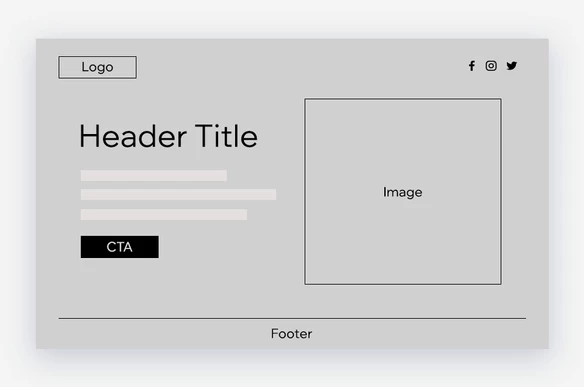
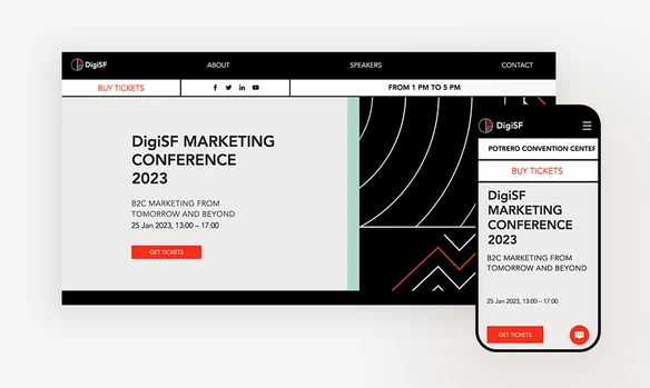
To give you a better sense of the difference between the two, we’ve provided an example template of each below:
Homepage template:
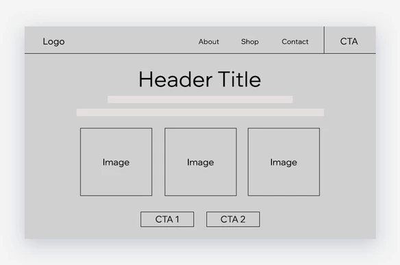
Landing page template:
How to create a landing page
You can create your own landing page using a free ready-made landing page template. All of these templates are built by professional designers and marketing experts, so they’re a good fit for driving conversions and making sales. They’re also fully customizable, which you can adapt to your company logo, brand colors or anything else. You can even use the opportunity to design two different pages and see which one performs better amongst your audience.
Just remember: any landing page you create needs to convey the value you’re providing. Potential customers will only provide their contact information or make a purchase from a landing page if they truly believe it can benefit them.
Take a look at this comprehensive article for more information on how to create a landing page for free.
Types of landing pages
Now that you know what a landing page is and how to create one, let’s dive into the two primary types of landing pages:
- Lead generation landing page: Also called a “lead gen” or a “lead capture” page, this mini-site generates leads by collecting information about your audience. It typically includes a form where visitors can submit their contact information, allowing you to follow-up over email and continue the line of communication. Lead gen pages are a great way to gain insight into who your potential customers are as well as how to reach them. To encourage users to enter their details, offer an incentive such as a coupon code, e-book and webinar, or exclusive content via newsletter.
- Clickthrough landing page: This type of landing page takes users to a sales or subscription page. It typically has a CTA that sends visitors directly into the checkout flow, nudging them to buy or subscribe. They’re often found on ecommerce or SaaS sites that are focused on making immediate sales.
- When considering which type of landing page is right for your business, think about your goals. Are you interested in gathering contact information for leads? Are you offering a unique sale? Are you collecting RSVPs for an event? Focusing directly on this goal will help you build a precise and highly targeted page.
When to use a landing page
No matter what your goals are, there are a few ways you can achieve them using a landing page. Here are the different kinds of situations in which a landing page comes in handy:
- Directing users to your product: By creating a landing page with an actionable CTA, such as “Buy Now,” you can bring users directly to your product purchase page or online store.
- Offering a free trial: If you offer a subscription service, use a landing page to get users to sign up for a free trial.
- Capturing leads from a blog post: Turn your blog readers into leads by incentivizing them to enter their contact details in exchange for more in-depth content, such as a free e-book, whitepaper or even a webinar.
- Obtaining newsletter subscribers: Use a landing page to encourage signups to your email newsletter. You can include a strong CTA like “Subscribe now” and “Sign up” to get people to subscribe.
- Getting event registrations: Capture additional leads with a landing page that entices people to register for an event, such as a webinar or online course.
- Creating user memberships: Use a landing page to get people to sign up for a paid membership that grants them VIP perks, such as exclusive content or members only invites.
Sources: Bluleadz, Omnisend, Unbounce, Portent
Anatomy of a landing page
At this point, you should have a big picture view as to what a landing page is and why it’s important for your business. Let’s go over the basic elements of landing page design so that you’ll know exactly what to include:
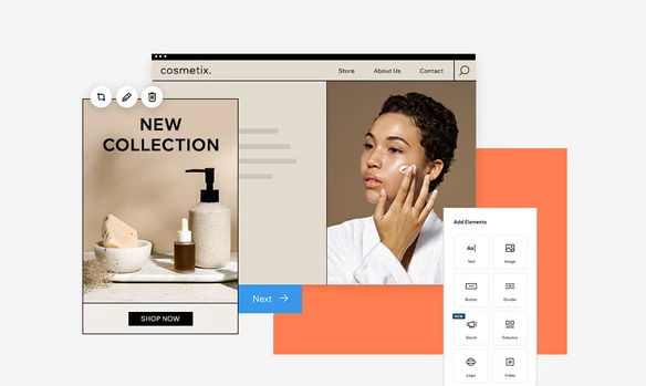
01. Powerful visuals
Capture your audience’s attention right away with a professionally designed template, an impactful image, a video or animation relevant to your campaign. This is your chance to shape the content in a way that resonates emotionally with your visitors. Be sure to place your most important visual content toward the top of the page, also known as above the fold.
This term goes back to the beginnings of the printing press, referring to the top half of a front page of a newspaper where the most important story is featured. Today, the term is also used to describe the top half of a website. By placing your most valuable content above the fold, visitors will immediately be drawn in and more likely to make a purchase.
02. Enticing headlines
Like a headline in a newspaper, a title on a webpage can make or break whether people will want to keep on reading. A strong landing page headline may mean using powerful statistics in order to draw in readers. Other times, it may include using an actionable statement that speaks to your audience’s needs.
The key is to write an H1 headline – often, supplemented with a supporting H2 subheadline – that immediately resonates with your audience and makes a promise to resolve their problems or improve their lives.
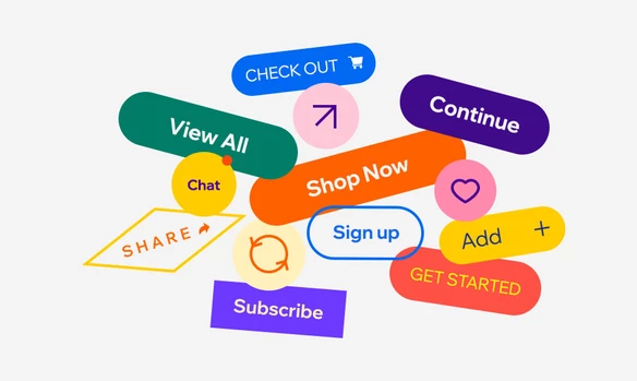
03. Strong calls-to-action
A CTA is the short phrase that prompts visitors to complete your desired goal, and it’s one of the defining elements of a landing page. After all, 90% of visitors who read your headline will also read your call-to-action (CTA). It should be the action item you want visitors to take – for example, Subscribe, Start My Free Trial, or Register Today. If you’re stuck on what to use as your CTA, check out these powerful call-to-action examples to inspire you.
04. Summary of benefits
On a landing page, every word counts. You have one page to persuade your visitors to click the CTA and take action. Keep in mind that your audience is more likely to convert if they understand the benefits of your offer. Rather than using your limited web space to give a detailed explanation of what your offering includes, focus on explaining what people can gain if they purchase or sign up.
05. Customer testimonials
Even after summarizing the important benefits of your offer,, you’ll need to find a way to back up your claims. The best way to do this is by providing customer testimonials. These are quotes from actual customers who like, use and know your product.
Including testimonials on your landing page can be instrumental in motivating people to click the CTA because it helps build and establish trust. Make sure they are from actual users who fall within your target market. Adding visual components, such as photos of your customer or videos of them reviewing your product, will help grab people’s attention. You can also link to customer social media pages so visitors can verify their legitimacy. If you need help determining the types of testimonials that are most effective for converting leads, consider using a tool like Speculoos.
06. Closing statement
For those visitors who scroll all the way to the bottom of your landing page, you can pack a punch with a persuasive closing argument in which you reiterate why they should convert. This statement should reinforce the main points of the page. While many visitors won’t reach these final lines, a closing statement nonetheless has the power to give that final push to those who are still on the fence.
Landing page best practices
As you develop your campaign, keep in mind these landing page best practices in order to create the most effective one for your business:
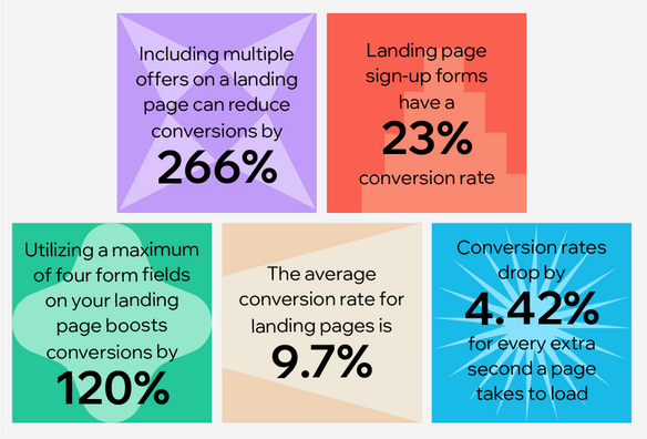
- Minimize navigation: Avoid having a navigation menu, as you’ll want to keep your visitors on the page instead of sending their gaze elsewhere. Likewise, limit your internal links so that you direct users to your CTA, rather than carrying them to another page. Make sure to keep your content and navigation simple, as fewer links increase conversions.
- Maximize readability: Long chunks of text can bore, overwhelm or distract your visitors. On the other hand, making your text short, sweet and skimmable – and using a healthy dose of white space – will grab hold of your audience’s attention right away and bring their eyes directly to the CTA. This isn’t the place to get too creative with your content – save that for your blog. Every word should serve a very specific purpose, which is, of course, to get your audience to click on your CTA.
- Maintain consistency: Potential customers will be directed to your landing page from an ad, whether it’s in an email, social media or on Google search results. To prevent any confusion while moving from point A to point B, make sure the content of your ad matches the content of your landing page. This not only includes the actual text, but the font and colors, as well. It should be aligned with your branding and share similar features to your homepage. This will allow your audience to seamlessly move through your marketing funnel with ease and minimal distraction.
- Make your CTA prominent: Your landing page should include a CTA that stands out. To achieve this, use clear and direct language and a CTA button that contrasts visually from the background. Place the CTA button multiple times across the landing page to give visitors the option to click regardless of where they are on the page.
- Target specific markets: An effective landing page targets potential customers in a specific stage of the marketing funnel. You’ll want to be sure that the content on your page is in keeping with the intent of your audience. Once you’ve segmented leads, you can even design multiple landing pages that target these different groups of potential customers.
- Actions should be simple and clear. Whether the purpose of your landing page is to gather contact information or make a sale, all forms should be short and require people to fill out only vital information. When collecting contact information, keep it to a name, email address, and one or two short questions that are necessary for your marketing campaign. If your goal is for visitors to make a purchase, the sales form should be clear and also contain minimal text to reduce any opportunity for confusion.
- Focus on the consumer: The content of your landing page should focus predominantly on the consumer, not on your company. Instead of talking about how great your business is and all of its achievements, you’ll want to direct your audience’s attention to how they can benefit from becoming a customer.
- Place important content above the fold: Don’t depend on visitors to scroll in order to convert. Place at least one CTA button above the fold where it’s immediately visible and instantly clickable. The other key elements of your landing page, such as the image and headline, should be above the fold as well.
- Make it mobile-friendly: Make sure your landing page not only looks great on any device, but that it loads quickly. A good portion of your traffic will come from mobile browsing, and these visitors are unlikely to convert if the page looks clunky on their smaller screen or if it loads too slow.
How to get traffic to your landing pages
Now for the fun part – bringing visitors to your landing page so they can convert. Here are four main avenues for growing traffic:
01. Social media
As one of the most prominent platforms for engagement with your target audience, social media is the first place to start promoting your landing page. Whether it’s on Facebook, LinkedIn, Twitter or Pinterest , take the opportunity to create a compelling post with a link to your landing page. That way, you’ll target people who are already interested in your brand and bring in quality traffic.
02. Email marketing
Email marketing remains one of the most effective methods for attracting traffic to your landing page. For that reason, accompany your social media promotion with an email campaign to send out to your contact list.
If you nail the email subject line, visuals, layout and copywriting, your landing page will get a noticeable boost of incoming visits. If you’re not sure where to start, take a look at this expert email marketing guide.
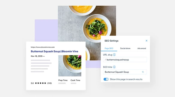
03. Optimize for SEO
Bring more visitors to your landing pages by optimizing them so they rank high on search engine results pages, like Google. The higher your content ranks, the more people will click on your link.
You can do this by adding a combination of strategic short-tail and long-tail keywords to your landing pages. You can determine which keywords to target by doing some research on SEO tools like Ahrefs or Semrush. Make sure to include these words or terms in your title tag, meta description and in any headers on your page.
Creating a website with Wix means that you can customize your on-page SEO, including meta tags, URL slugs, canonical tags and other page elements.
Headers, for example, are not only there for readability, but are actually part of HTML language that Google reads to determine which websites to rank. When Google scans website content, it uses headers to help analyze the information of a website or web page. Headers are arranged in a hierarchy from H1 to H6, and are a way to prioritize the content on your page. H1 is your page title, which Google scans first to determine the overarching topic of your site. This is why you’ll want to include your main keyword in your H1 title and be sure that it explicitly describes the content on your page.
Additionally, a landing page will maintain any SEO authority it has accumulated over time. For example, if you create a landing page for a seasonal marketing campaign, it’s good practice to keep the page up and running even after the campaign is over. Then, you can reuse the same URL when it’s time to rerun the campaign. All you’ll have to do is update the content.
04. Paid ads
Social media marketing, email marketing and SEO are free ways to draw traffic to your landing page. However, if you think you could use an additional boost, consider promoting your landing page via paid ads. By targeting people based on their interests and demographics, you can be sure that they are prompted with the landing page designated for their specific niche.
- Search results ads: Have you ever noticed the ads listed at the top of Google search results pages? Those are search results ads. Based on keywords that you define, these ads show up on Google and other search engines when people include those same terms in their queries.
- Social media ads: When you create paid social media posts, social networks like Facebook and Instagram promote them to people who match the profile of your target audience based on their interests. That allows you to reach the kinds of people who have interests that are relevant to your product or service.
- Ad placements: Another option is to use third-party advertising tools to place banner ads on websites frequented by your audience.
Based on your campaign goals, you may choose to diversify your advertising efforts or focus on just one of these platforms. Whichever you decide, be sure to consistently monitor your results so that you can adapt your campaign accordingly.
Benefits of a landing page
Landing pages offer enormous growth potential for your company and are a powerful tool to help your business continue to flourish. Here are the main benefits of incorporating landing pages into your marketing strategy.
- Dramatically improve your conversion rate. As mentioned earlier, landing pages focus on a single goal and compel your visitors to take action. In doing so, they move people further down the marketing funnel – from anonymous visitors to leads, and finally to paying customers.
- Provide you with valuable insights about your audience. If you include a signup form on your landing page, you can ask for information about your audience’s demographics to gain a better understanding of your target market. On top of that, the channels that work – or don’t – for your landing page promotion say a lot about the interests and habits of your prospective customers. You can use this information to optimize your targeting efforts and marketing strategy as a whole.
- Increase brand recognition and awareness. An attractive, well designed landing page conveys professionalism, value and appeal of your brand. Not only are landing pages an excellent tool for converting leads in the moment, but they help bolster your brand simply by getting the word out. The more people that know about you, the better off your business.
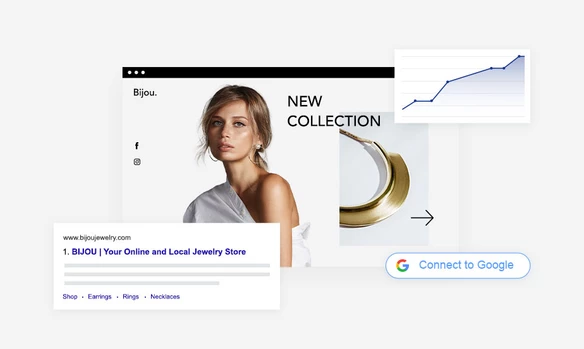
- Landing pages are measurable. By analyzing metrics such as conversions, bounce rate, page views and traffic source, you can get a sense of how a particular marketing campaign is performing. Take a look at where the traffic is coming from – for instance, a paid post or an email marketing campaign – to determine which marketing assets are proving most effective.
Landing page examples
To get a better understanding how to implement these strategies, take a look at these landing page examples to see how other companies are designing theirs:
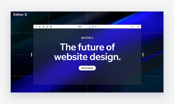
01. Editor X by Wix
Created especially for web designers and agencies, Editor X offers advanced design capabilities that allow you to create complex websites without using code. This sleek and simple landing page features dark blue colors with bold white letters.
Upon entering the site, you are immediately greeted with the heading, The future of website design in large white letters that appear to be displayed on the Editor X editing screen. A ray of lighter blue streams through the middle of the image highlighting the word future, contrasting the dark blue surrounding it. The CTA button, “Start Creating,” is placed directly below the text.
As you scroll though the page, you’ll notice there are no links to any other pages that have the potential to distract the audience from the main CTA. Instead, there are short statements describing various features of the tool, a CTA button next to each, and large, captivating images. This landing page incorporates minimal text and modern, futuristic imagery to grab the attention of the audience that appeals to a more professional crowd.
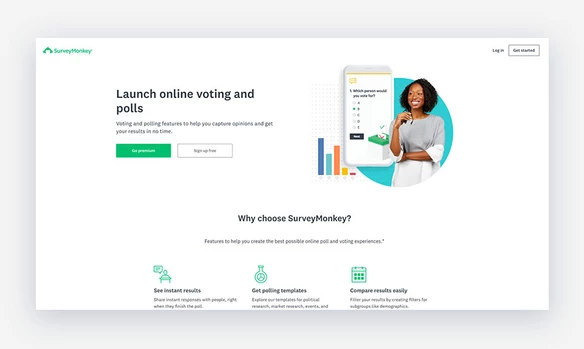
02. SurveyMonkey
As a global leader in polling and survey software, SurveyMonkey has designed a landing page that presents two options to their audience upon landing on their page: Go Premium and Sign Up For Free. The CTA is accompanied by a brief line describing what the product is: Voting and polling features to help you capture opinions and get your results in no time.
An abundance of white space throughout helps readers follow the content without becoming distracted. As you continue to scroll, you’ll see that SurveyMonkey provides only essential information, including pricing for their three most popular plans and a contact form to receive a demo. The form requires very minimal information, including name, business email address, job title and company name.
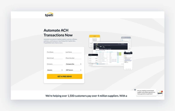
03. Tipalti
Tipalti is a B2B financial company that has designed a landing page to help them gather new leads. Visitors are immediately greeted with a form to collect contact information along with a large yellow button containing the main CTA, Get a free demo.
The company maintains elements of their branding, including colors, font and logo, throughout the page to remain consistent with their marketing efforts. As you scroll below the fold, you can see they highlight facts as to why you should choose their service, including testimonials with photos of each customer. You’ll also see CTA buttons presented several times, providing visitors multiple opportunities to schedule a demo.
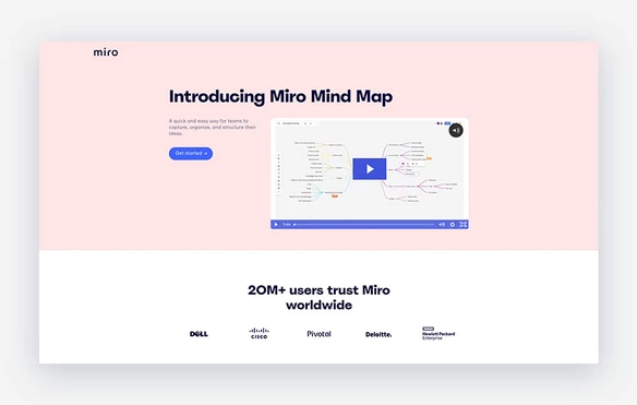
04. Miro
Miro is an online collaboration tool that allows teams to create visual boards to plan projects and tasks. Upon entering this landing page, you are greeted with a video that displays the tool’s capabilities. Without clicking play, the video shows a preview of how the project boards function. This immediately grabs your eye and engages the viewer.
The CTA, Get Started, is located to the left, surrounded by an abundance of blank space which forces your attention to these two places. Toward the bottom, you’ll notice that the site features some of Miro’s biggest clients and displays the main benefits of using the product. This simple, yet captivating design is an excellent example of a landing page done right.
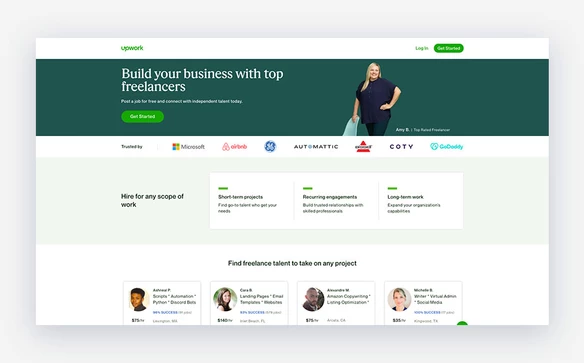
05. Upwork
Upwork is a leading freelancer platform that markets both to freelancers as well as businesses who want to hire them. This particular landing page is targeting businesses looking to hire freelancers for independent work. Get Started, the primary CTA, is located twice above the fold, making it easy for leads to click and convert.
Its brand colors, green and white, are adorned throughout the page along with a list of leading clients, benefits of hiring through Upwork and a user testimonial at the bottom. The strip at the top of the page features an image of one of Upwork’s top rated freelancers, which helps establish a more personal connection to the business.
Reference: https://www.wix.com/blog/2021/07/what-is-a-landing-page/